New Options for Image Captions
You can currently add a caption to your image clues, which will appear as text overlaid on the bottom of the image. However, we recently received feedback from a teacher who wanted to show the image and the accompanying text side-by-side instead of on top of one another.
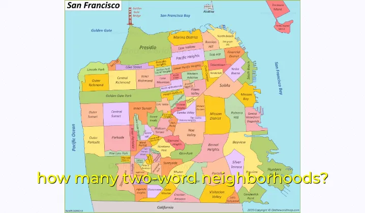
This sounded like a great idea. Sometimes it’s easier to parse the question when the image and text are presented separately. And there are plenty of cases where you wouldn’t want the contents of the image to be obscured by text. For example, if the image is a labelled map:

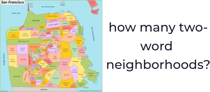
It’s difficult to read the labels on the map with a giant caption in the way. Even if the caption wasn’t obscuring other text, it would be really distracting. On the other hand, if the image and its caption are prested alongside each other, it’s easier to understand the question and consider the image without any obstruction.

Enabling side-by-side mode
Side-by-side mode is applied on an image-by-image basis. To enable side-by-side mode in your images, open up the word editor by adding a new word or editing an existing one.
It should go without saying at this point that the word you’re creating or editing must use an image.
Scroll down in the editor window until you see the “Caption” field. You can type your caption in the text input, and check the “Side-by-side mode” checkbox on the top right side of the field.
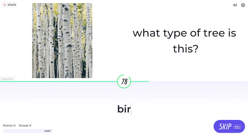
In game, side-by-side mode really shines. With all that extra screen space, images and their captions can really shine. Just check out how clean and understandable this looks:

Pretty cool. 👍 Thanks to Beau for suggesting this feature! If you think of something that would really improve your teaching experience with Knoword, please let us know and we’ll do our best to make it happen for you.